
Maxima of the Month -- Logo Proposal

Maxima of the Month -- Logo Proposal
MOTM is a pretty big honor for Org members. I think it's a great idea, and hope it continues. The winners are deserving, and the inspiration to the rest of us... priceless. I can only imagine the pride that comes with seeing the MOTM graphic under your avatar. And while I'll never earn MOTM recognition myself, I can do something, in a small way, to contribute to the program.
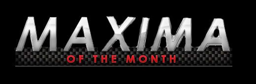
The current MOTM logo is... dated. It uses the old MAXIMA font, and has a crude drop-shadow effect that just doesn't work. And more obvious yet, when the logo is seen against the "Dark Style", the anti-aliasing effect fails against the dark background. For example:

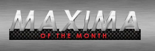
But if we use both light and dark backgrounds in the image, with a more contemporary font, the MOTM logo could look good in both styles. For example:

The proposed graphic is the identical resolution: 202 x 36 pixels, so it would slip right in without compromising layout.

The point of this thread is to make a constructive, value-added contribution to the Org, but one which doesn't radically change things. I think MOTM winners deserve to be proud of their accomplishment, and they deserve a quality Badge of Honor.
So what do you think? Do you like it? Hate it? Don't care? Have a better idea you'd like to propose?
The current MOTM logo is... dated. It uses the old MAXIMA font, and has a crude drop-shadow effect that just doesn't work. And more obvious yet, when the logo is seen against the "Dark Style", the anti-aliasing effect fails against the dark background. For example:
But if we use both light and dark backgrounds in the image, with a more contemporary font, the MOTM logo could look good in both styles. For example:
The proposed graphic is the identical resolution: 202 x 36 pixels, so it would slip right in without compromising layout.
The point of this thread is to make a constructive, value-added contribution to the Org, but one which doesn't radically change things. I think MOTM winners deserve to be proud of their accomplishment, and they deserve a quality Badge of Honor.
So what do you think? Do you like it? Hate it? Don't care? Have a better idea you'd like to propose?


Senior Member
Joined: Nov 2004
Posts: 605
From: St. Charles, MO

Last edited by 95VQ30; Feb 5, 2011 at 09:31 AM.


And no, I don't mind at all. My point in this thread is to get a new & improved MOTM logo for the Org. It doesn't have to be my work. I've got the Forum Banner going on... plenty proud of that already.

Last edited by Rochester; Feb 5, 2011 at 09:46 AM.

The proposed one is a much cleaner look. However, what is the attraction too the Green font? Surely there must be another option that is more like an actual "Maxima" emblem? The style is fine, just that color..Not a fan.

Some people freak out with too much change.


The current MOTM logo is... dated. It uses the old MAXIMA font, and has a crude drop-shadow effect that just doesn't work. And more obvious yet, when the logo is seen against the "Dark Style", the anti-aliasing effect fails against the dark background.
The proposed graphic is the identical resolution: 202 x 36 pixels, so it would slip right in without compromising layout.
The point of this thread is to make a constructive, value-added contribution to the Org, but one which doesn't radically change things. I think MOTM winners deserve to be proud of their accomplishment, and they deserve a quality Badge of Honor.
So what do you think? Do you like it? Hate it? Don't care? Have a better idea you'd like to propose?
Nicely done!!


The "screws" give it a neat license plate look. (Ah, I see your ninja edit.) This is good work, 95VQ30.
Last edited by Rochester; Feb 5, 2011 at 10:13 AM.

I like the ideas, guys. I had 2 ideas and I did them pretty quickly and got tired of doing everything precisely lol you will see it got sloppy after "MA" lol but I like these and it would be easy to change in 95VQ30's .psd file...
or
The brushed one looks really cool, IMO.
EDIT: oops, accidentally edited out the maxima.org on the side lol and I'm not a big fan of the green font, Rochester but it still looks good. I think the brushed metal looks a little better than just a gradient. And I really like the screws idea, too.
or
The brushed one looks really cool, IMO.
EDIT: oops, accidentally edited out the maxima.org on the side lol and I'm not a big fan of the green font, Rochester but it still looks good. I think the brushed metal looks a little better than just a gradient. And I really like the screws idea, too.

Senior Member
Joined: Nov 2004
Posts: 605
From: St. Charles, MO
I like the ideas, guys. I had 2 ideas and I did them pretty quickly and got tired of doing everything precisely lol you will see it got sloppy after "MA" lol but I like these and it would be easy to change in 95VQ30's .psd file...
or
The brushed one looks really cool, IMO.
EDIT: oops, accidentally edited out the maxima.org on the side lol and I'm not a big fan of the green font, Rochester but it still looks good. I think the brushed metal looks a little better than just a gradient. And I really like the screws idea, too.
or
The brushed one looks really cool, IMO.
EDIT: oops, accidentally edited out the maxima.org on the side lol and I'm not a big fan of the green font, Rochester but it still looks good. I think the brushed metal looks a little better than just a gradient. And I really like the screws idea, too.

The larger file has a texture in the back ground(see above), it is very subtle- too much background noise and it pulls away from the main focus(the logo/text).


I think the version Rochester created has the Maxima in the correct "Badging" font and looks great, but the "of the Month" font looks old. A smoother, sans-serif font there would match up with the Maxima logo nicely.
Have at it!
 Here's a blank.
Everyone please keep this in mind -- no one asked anyone to contribute to this idea, and that includes me.
That said, maybe we can have an Admin move this to the Photoshop thread after enough people get interested, and hack things out there before asking Dan if he'd consider a new MOTM logo.
I'd like to see something collaborative happen, if enough people are interested in contributing their ideas.
That said, maybe we can have an Admin move this to the Photoshop thread after enough people get interested, and hack things out there before asking Dan if he'd consider a new MOTM logo.
I'd like to see something collaborative happen, if enough people are interested in contributing their ideas.

LOL the "new" one was yours Rochester...but let me know what you guys want to do since now i see there are a few of them out there.
IB team is changing so there's a little transition for me on who to go to and etc...so it might be a little longer than usual but it doesn't really affect you guys.
but yes...i agree that we should change the logo.
IB team is changing so there's a little transition for me on who to go to and etc...so it might be a little longer than usual but it doesn't really affect you guys.
but yes...i agree that we should change the logo.
Hi, Dan. Well... kind of shot myself in the foot with this thread. LOL! But I stand by what I said earlier:
There was a flurry of activity here when I started the thread last week, but then it died. Don't know why. 
Dan, please let us know if you would like to see this effort continue. And if you do, let's put a time-line on the task so it doesn't fade away. Otherwise, by all means, use the GIF that I created last year and move on.
Thanks for weighing in on this thread.
Dan, please let us know if you would like to see this effort continue. And if you do, let's put a time-line on the task so it doesn't fade away. Otherwise, by all means, use the GIF that I created last year and move on.
Thanks for weighing in on this thread.
Joined: Apr 2003
Posts: 2,342
From: Queenz, nYc CarClub: NYCMAXIMAS.ORG Website: www.ChinoX.net
ooooo I was thinking the same thing as I'm trying to earn that MOTM spot sometime this year...either way I will chime in with my designs later, I am feeling 95VQ30 color scheme and carbon fiber touch...
Glad you found this thread, Chino. Good to have you on-board with this idea.
You know, I'm all-in with my proposal, so I could well envision you and 95VQ30 submitting your work (and anyone else, for that matter) by a particular date, and then having another friendly poll. That would be fun.
I think the important consideration is coming up with a logo that works well with the 2 display themes we have on the Org. That, and appropriate resolution. Anyway, I'm psyched to see what you come up with.
OK how about we vote...i like to be semi diplomatic about all this.
post what you have. i'll create a new thread and will have a poll on it.
(similar to the banner).
Rochester i'm ready to do this now...wasn't before when you send me the image.
BUT now it appears that there are more proposed images.
so post what you have...i'll make a poll thread. we'll go from there...ok?
Joined: Apr 2003
Posts: 2,342
From: Queenz, nYc CarClub: NYCMAXIMAS.ORG Website: www.ChinoX.net
Glad you found this thread, Chino. Good to have you on-board with this idea.
You know, I'm all-in with my proposal, so I could well envision you and 95VQ30 submitting your work (and anyone else, for that matter) by a particular date, and then having another friendly poll. That would be fun.
I think the important consideration is coming up with a logo that works well with the 2 display themes we have on the Org. That, and appropriate resolution. Anyway, I'm psyched to see what you come up with.
You know, I'm all-in with my proposal, so I could well envision you and 95VQ30 submitting your work (and anyone else, for that matter) by a particular date, and then having another friendly poll. That would be fun.
I think the important consideration is coming up with a logo that works well with the 2 display themes we have on the Org. That, and appropriate resolution. Anyway, I'm psyched to see what you come up with.

OK how about we vote...i like to be semi diplomatic about all this.
post what you have. i'll create a new thread and will have a poll on it.
(similar to the banner).
Rochester i'm ready to do this now...wasn't before when you send me the image.
BUT now it appears that there are more proposed images.
so post what you have...i'll make a poll thread. we'll go from there...ok?
post what you have. i'll create a new thread and will have a poll on it.
(similar to the banner).
Rochester i'm ready to do this now...wasn't before when you send me the image.
BUT now it appears that there are more proposed images.
so post what you have...i'll make a poll thread. we'll go from there...ok?
