General Maxima Discussion This a general area for Maxima discussions for all years. For more specific questions, visit one of the generation-specific forums.
View Poll Results: Work with the new one or keep the old one...
Oldy but a goody
7
9.33%
Fresh and new
68
90.67%
Voters: 75. You may not vote on this poll

A New Look For Maxima.org?

Thread Tools
 
Search this Thread
 
Old Dec 10, 2005 | 01:56 PM
  #41  
naijai's Avatar
Supporting Maxima.org Member
iTrader: (1)
 
Joined: Jun 2002
Posts: 1,076
pesky kid complaing i say go ahead and slap it on as it is right now looks good
Old Dec 10, 2005 | 02:03 PM
  #42  
silvermax2k2's Avatar
Supporting Maxima.org Member
iTrader: (1)
 
Joined: Jun 2002
Posts: 2,935
Originally Posted by naijai
pesky kid complaing i say go ahead and slap it on as it is right now looks good

Old Dec 10, 2005 | 02:36 PM
  #43  
Business810's Avatar
Senior Member
iTrader: (6)
 
Joined: Aug 2003
Posts: 358
Originally Posted by DIGITAL
I think he is referring to the default layout.
Yes, I was referring to the default layout.
Old Dec 10, 2005 | 03:02 PM
  #44  
FunLovinMaxima's Avatar
Senior Member
 
Joined: Apr 2005
Posts: 4,955
From: a charming town in Connecticut first settled in the 1600s
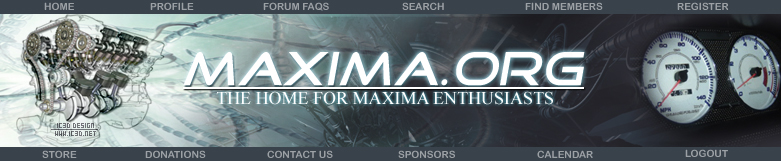
As the others have said, use the old font, use rotating max engines (if possible), use a maxima gauge, and change it back to "the home FOR maxima enthusiasts."

good job taking the initiative here
Old Dec 10, 2005 | 03:16 PM
  #45  
808MAX-SPEC's Avatar
Senior Member
iTrader: (7)
 
Joined: Jul 2003
Posts: 1,099
From: Honolulu, HI
Great work Digital! The new banner matches most of the bkgd styles in the quick style chooser. The use of white grays and black is a better match. Someone mention using the "Goodtimes" font. I will add my vote to that.

Not to open up a new can of worms but...
...should the tag include Cefiro, I30 and I35?

"Home for the Maxima Cefiro & I30/35 Enthusiasts"

It's because of the fact that we are a community and family of this particular make and model(s) of cars.

I leave this decision up to the managing team.
Old Dec 10, 2005 | 03:24 PM
  #46  
Haibert88's Avatar
Senior Member
 
Joined: Sep 2005
Posts: 181
I like how you did the redline rpm gauge
Old Dec 10, 2005 | 03:41 PM
  #47  
NCSU_MAX's Avatar
Maximoneypit
iTrader: (36)
 
Joined: Oct 2004
Posts: 21,704
From: Nashville, TN
Looks Great!! got my vote
Old Dec 10, 2005 | 03:58 PM
  #48  
Digital's Avatar
Thread Starter
VIP
iTrader: (1)
 
Joined: Oct 2003
Posts: 1,163
From: Fairfield County, CT
Any and all of your comments can be done, it just comes down to what the management sees fit. The goodtimes font was not working on either my pc or my laptop, I may have to check it out on my mac to see if it will work there...

Sorry I have been away, I have been doing work on a clients business card. Next in line tonight is the CE Calendar, have to come up with a nice layout for one big image, with 3 smaller images of cars down the sides.

Thank you guys for your comments, positive and negative. They only help me get better!
Old Dec 10, 2005 | 04:07 PM
  #49  
DA-MAX's Avatar
Eat, sleep, and sh*t 2JZ
iTrader: (10)
 
Joined: Nov 2000
Posts: 13,978
I like it
Old Dec 10, 2005 | 04:10 PM
  #50  
BigLou93SE's Avatar
Senior Member
iTrader: (10)
 
Joined: Jun 2004
Posts: 2,581
From: Danbury, CT \ Rochester, NY
You have my vote too, great work. I also second everything that everyone has criticised so far as well: the font back to normal, the home for maxima enthusiasts, and using a real tach from a Maxima (the last part is pretty minor though, it doesn't look bad with that tach.). Again, good work, it definately works well.
Old Dec 10, 2005 | 04:22 PM
  #51  
Mass_Media's Avatar
Mass_Media™
 
Joined: Dec 2003
Posts: 2,812
Thats not sprints car its Y2KevSE I think. He was the admin b4 sprint.

I like it only thing I would change is the font keep it the same so that way it matches everything.
Old Dec 10, 2005 | 05:14 PM
  #52  
Digital's Avatar
Thread Starter
VIP
iTrader: (1)
 
Joined: Oct 2003
Posts: 1,163
From: Fairfield County, CT
Working on the font now.
Old Dec 10, 2005 | 05:16 PM
  #53  
deezo's Avatar
Supporting Maxima.org Member
iTrader: (3)
 
Joined: Apr 2001
Posts: 14,285
From: FV, NC
Originally Posted by MrGone
1. use the old font, it matches the stickers and everything else
2. use a VE cut away, not a peice of **** VQ, or have one for each engine and rotate it (rotate on page loads that is)
equal rights biatch

It's time to put that VE up on the shelf man. Long live the VQ!


I like it.
Old Dec 10, 2005 | 05:40 PM
  #54  
Sprint's Avatar
Administrator
iTrader: (10)
 
Joined: Feb 2001
Posts: 26,943
I like it too
Old Dec 10, 2005 | 05:40 PM
  #55  
Sprint's Avatar
Administrator
iTrader: (10)
 
Joined: Feb 2001
Posts: 26,943
do it without the sponsor by XXXXX .... i will add that later
Old Dec 10, 2005 | 06:12 PM
  #56  
MrGone's Avatar
Supporting Maxima.org Member
iTrader: (30)
 
Joined: Apr 2002
Posts: 40,646
From: 127.0.0.1
Originally Posted by deezo
It's time to put that VE up on the shelf man. Long live the VQ!


I like it.
I will meet you half way with the VQ35


VQ30 = no VTC's, no Power Valve = weaksauce
we don't want n00blets thinking we are weaksauce
Old Dec 10, 2005 | 06:30 PM
  #57  
Digital's Avatar
Thread Starter
VIP
iTrader: (1)
 
Joined: Oct 2003
Posts: 1,163
From: Fairfield County, CT
I GOT THE FONT TO WORK! HAHAHA


pwned.


Old Dec 10, 2005 | 06:35 PM
  #58  
TXT-1's Avatar
Senior Member
iTrader: (1)
 
Joined: Jul 2003
Posts: 2,158
Awesome job! You got my vote
Old Dec 10, 2005 | 06:38 PM
  #59  
Threadkilla's Avatar
lifted and locked
 
Joined: Jul 2003
Posts: 129
Looks really good. Nice work.

One more vote for 'fresh and new'.
Old Dec 10, 2005 | 06:38 PM
  #60  
Digital's Avatar
Thread Starter
VIP
iTrader: (1)
 
Joined: Oct 2003
Posts: 1,163
From: Fairfield County, CT
Originally Posted by TXT-1
Awesome job! You got my vote
Thnx man, I pretty much spent all day on it to get it right and edit the thing that the people didn't like. I'm very pleased with the outcome.
Old Dec 10, 2005 | 06:40 PM
  #61  
Digital's Avatar
Thread Starter
VIP
iTrader: (1)
 
Joined: Oct 2003
Posts: 1,163
From: Fairfield County, CT
Originally Posted by Threadkilla
Looks really good. Nice work.

One more vote for 'fresh and new'.
Thank you much, I'm glad I got that font to work, 2 pc's no go, mac, didn't try, my fiance's laptop did work though, probably cause theres no extra fonts on it, only the stock ones.

Maybe my 2 design pcs are overloaded with fonts heh. :P
Old Dec 10, 2005 | 06:49 PM
  #62  
2K3MAX2NV's Avatar
"tse-tse fly"
iTrader: (10)
 
Joined: Oct 2004
Posts: 1,529
From: L.I., NY
good work Marc....as always!

Did you get summer's approval? Hahaha
Old Dec 10, 2005 | 06:54 PM
  #63  
Digital's Avatar
Thread Starter
VIP
iTrader: (1)
 
Joined: Oct 2003
Posts: 1,163
From: Fairfield County, CT
Originally Posted by 2K3MAX2NV
good work Marc....as always!

Did you get summer's approval? Hahaha
Thank you! I gotta do it up, each time, yanno.

Nah, not as of yet, Ms. Walker is a very busy woman. We'll see what happens.
Old Dec 10, 2005 | 07:14 PM
  #64  
DrKlop's Avatar
Driving is the next best thing
iTrader: (3)
 
Joined: Jun 2005
Posts: 2,023
From: NYC
Looks grate man!

On the other hand, I was thinking of making in a little more contrast, maybe something like this?


What do you think?

And to make it easier to compare, this the original:

Old Dec 10, 2005 | 07:25 PM
  #65  
Digital's Avatar
Thread Starter
VIP
iTrader: (1)
 
Joined: Oct 2003
Posts: 1,163
From: Fairfield County, CT
Originally Posted by DrKlop
Looks grate man!

On the other hand, I was thinking of making in a little more contrast, maybe something like this?


What do you think?

And to make it easier to compare, this the original:

First couple look cool, but they do not match the forum colors, as you can see I made the color scheme to blend well with that of the default forum. You have good ideas, but, not for the default color scheme, it would not mesh like the original does. Thumbs up on the attempt though.
Old Dec 10, 2005 | 07:37 PM
  #66  
DrKlop's Avatar
Driving is the next best thing
iTrader: (3)
 
Joined: Jun 2005
Posts: 2,023
From: NYC
Yea, you probably right about that, but what if you keep the color scheme the same but make it a bit more contrast. I think it looks to blended in (Lord or the Rings or Matrix style)

I would have tried it myself, but I don’t have Photoshop so I can’t make the pic look exactly the way I want it to be.
Old Dec 10, 2005 | 07:40 PM
  #67  
Digital's Avatar
Thread Starter
VIP
iTrader: (1)
 
Joined: Oct 2003
Posts: 1,163
From: Fairfield County, CT
Originally Posted by DrKlop
Yea, you probably right about that, but what if you keep the color scheme the same but make it a bit more contrast. I think it looks to blended in (Lord or the Rings or Matrix style)

I would have tried it myself, but I don’t have Photoshop so I can’t make the pic look exactly the way I want it to be.
Matching is the way to be, you can't do contrast when you are working with dark colors like this, it's either make it blend nice, or make it so vivid and wild it hurts your eyes, there is no in between when working with a dark color w/o it looking cheesy, imo.
Old Dec 10, 2005 | 07:43 PM
  #68  
MardiGrasMax's Avatar
Supporting Maxima.org Member
iTrader: (14)
 
Joined: Aug 2000
Posts: 4,491
Awesome!!!!!!!!
Old Dec 10, 2005 | 07:51 PM
  #69  
Puppetmaster's Avatar
Supporting Maxima.org Member
iTrader: (48)
 
Joined: Apr 2004
Posts: 16,551
From: Fairfax, VA
I vote for this one:


Old Dec 10, 2005 | 07:52 PM
  #70  
Digital's Avatar
Thread Starter
VIP
iTrader: (1)
 
Joined: Oct 2003
Posts: 1,163
From: Fairfield County, CT
Originally Posted by MardiGrasMax
Awesome!!!!!!!!
Thanks Mardi
Old Dec 10, 2005 | 07:56 PM
  #71  
DrKlop's Avatar
Driving is the next best thing
iTrader: (3)
 
Joined: Jun 2005
Posts: 2,023
From: NYC
Nice, it looks much better than I expected!

Bottom-line: Never argue with pros!
Old Dec 10, 2005 | 07:56 PM
  #72  
gtr_rider's Avatar
192.168.1.1
iTrader: (50)
 
Joined: Dec 2000
Posts: 17,617
From: Ft. Lauderdale, FL
very nice..
Old Dec 10, 2005 | 08:02 PM
  #73  
Kevlo911's Avatar
Kevlo for President
iTrader: (36)
 
Joined: Dec 2000
Posts: 35,755
From: Lake Orion, MI
Org banner failure as of right now.
Old Dec 10, 2005 | 08:05 PM
  #74  
Northern Maxima's Avatar
Senior Member
 
Joined: Oct 2004
Posts: 1,803
From: Manitoba
I was fine with the old design but this definitely looks much nicer!
Old Dec 10, 2005 | 08:12 PM
  #75  
Zach95SE's Avatar
Supporting Maxima.org Member
iTrader: (3)
 
Joined: Jul 2004
Posts: 1,039
From: CT
I think next up would be a background scheme to match it well. Preferably a dark colored one.
Old Dec 10, 2005 | 08:13 PM
  #76  
Digital's Avatar
Thread Starter
VIP
iTrader: (1)
 
Joined: Oct 2003
Posts: 1,163
From: Fairfield County, CT
Originally Posted by DrKlop
Nice, it looks much better than I expected!

Bottom-line: Never argue with pros!
Indeed.
Old Dec 10, 2005 | 08:17 PM
  #77  
Digital's Avatar
Thread Starter
VIP
iTrader: (1)
 
Joined: Oct 2003
Posts: 1,163
From: Fairfield County, CT
Originally Posted by gtr_rider
very nice..
Thnx gtr_rider
Old Dec 10, 2005 | 08:20 PM
  #78  
Digital's Avatar
Thread Starter
VIP
iTrader: (1)
 
Joined: Oct 2003
Posts: 1,163
From: Fairfield County, CT
Originally Posted by Northern Maxima
I was fine with the old design but this definitely looks much nicer!
Thnx u much
Old Dec 10, 2005 | 08:20 PM
  #79  
Kevlo911's Avatar
Kevlo for President
iTrader: (36)
 
Joined: Dec 2000
Posts: 35,755
From: Lake Orion, MI
Now everything else needs to match.
Old Dec 10, 2005 | 08:21 PM
  #80  
Skiptronic's Avatar
Supporting Maxima.org Member
 
Joined: Feb 2005
Posts: 292
From: SF Bay Area
It's a great change. Good work.


All times are GMT -7. The time now is 11:14 AM.