
View Poll Results: Work with the new one or keep the old one...
Oldy but a goody


7
9.33%
Fresh and new


68
90.67%
Voters: 75. You may not vote on this poll
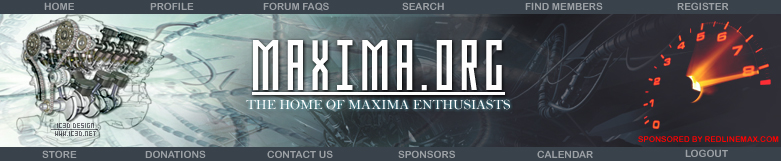
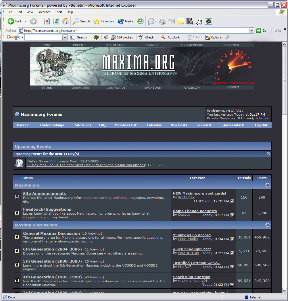
A New Look For Maxima.org?


Originally Posted by stephenlc
looks much cleaner now. Plus I am tired of lookin at sprinty's car. 

I like it and voted for it. One suggestion though - maybe also change the blue in all the bars (at the top of each post, top of each forum, etc.) to a shade of green, gray, or red or something, basically to match it to one of the colors in the new design for the top of the page. The blue goes well with the current logo, but if it can be changed (which I'd assume it would be able to in the Vbulletin software) something else might look better.
Originally Posted by xlcrew
i like the new background would like to see it with the maxima.org logo the way it is now. i hope that made since
Originally Posted by Business810
I like it and voted for it. One suggestion though - maybe also change the blue in all the bars (at the top of each post, top of each forum, etc.) to a shade of green, gray, or red or something, basically to match it to one of the colors in the new design for the top of the page. The blue goes well with the current logo, but if it can be changed (which I'd assume it would be able to in the Vbulletin software) something else might look better.
Originally Posted by mendon99
you know you can change the style/layout, right? bottom left on every page practically. mines on donkey style

Originally Posted by DIGITAL
Feedback welcome. Thnx guys.


Originally Posted by DrKlop
Looks much more professional than the currant one, but I think �Maxima.org� should be written with the same font as before. The design could be different but I really don�t like the idea of a complete change. Besides, the font used in the currant logo somewhat resembles the font of �Maxima� decals on our trunks and the font of the .org stickers. I do value the effort you put in it but I honestly think that the font should be different.
1. use the old font, it matches the stickers and everything else
2. use a VE cut away, not a peice of **** VQ, or have one for each engine and rotate it (rotate on page loads that is)
equal rights biatch
2. use a VE cut away, not a peice of **** VQ, or have one for each engine and rotate it (rotate on page loads that is)
equal rights biatch
ahhh! cliMAX!

Joined: May 2005
Posts: 792
kind of looks like one of my backgrounds..... used it for inspiration lol?
http://img.photobucket.com/albums/v2...yone/losbg.jpg
http://img.photobucket.com/albums/v2...yone/losbg.jpg
Originally Posted by MrGone
1. use the old font, it matches the stickers and everything else
2. use a VE cut away, not a peice of **** VQ, or have one for each engine and rotate it (rotate on page loads that is)
equal rights biatch
2. use a VE cut away, not a peice of **** VQ, or have one for each engine and rotate it (rotate on page loads that is)
equal rights biatch

10farkinchars
Originally Posted by lilaclucymaxima
Got my vote, good work.

Also, to everyone else, I wouldn't say vote that you don't like it just cause of the font, that can be changed. You are missing the whole pie if you are voting no cause of just the font.
Also x2, Sprint needs to okay this one before I go and add any other engine to it. It's easy I have the psd, I can do it.
Are you a graphic designer Digital?
THe Baner is beautiful and definately should be at the front of the page. The color scheme matches the background much better than the current blue baner.
Makes me want to open up my photoshop and see what I can produce also... hmmm...
THe Baner is beautiful and definately should be at the front of the page. The color scheme matches the background much better than the current blue baner.
Makes me want to open up my photoshop and see what I can produce also... hmmm...


